Design Guideline
One of the most important aspects of the dashboard project is, to maintain a common appearance of all dashboards. Therefore we have defined a Design Guideline to help you designing your dashboard.
Basic elements
A dashboard itself consists of two main elements. The first one is the content area, which is fully customizable by you. The second element is the so-called ContactCard - a predefined element which can be easily filled with your contact and project data.
Always keep in mind: you only have a very limited timeframe to attract users. Be respectful with their time. Users should be able to determine the main topic of your dashboard within 3 seconds and decide whether that is the right topic for their interest.
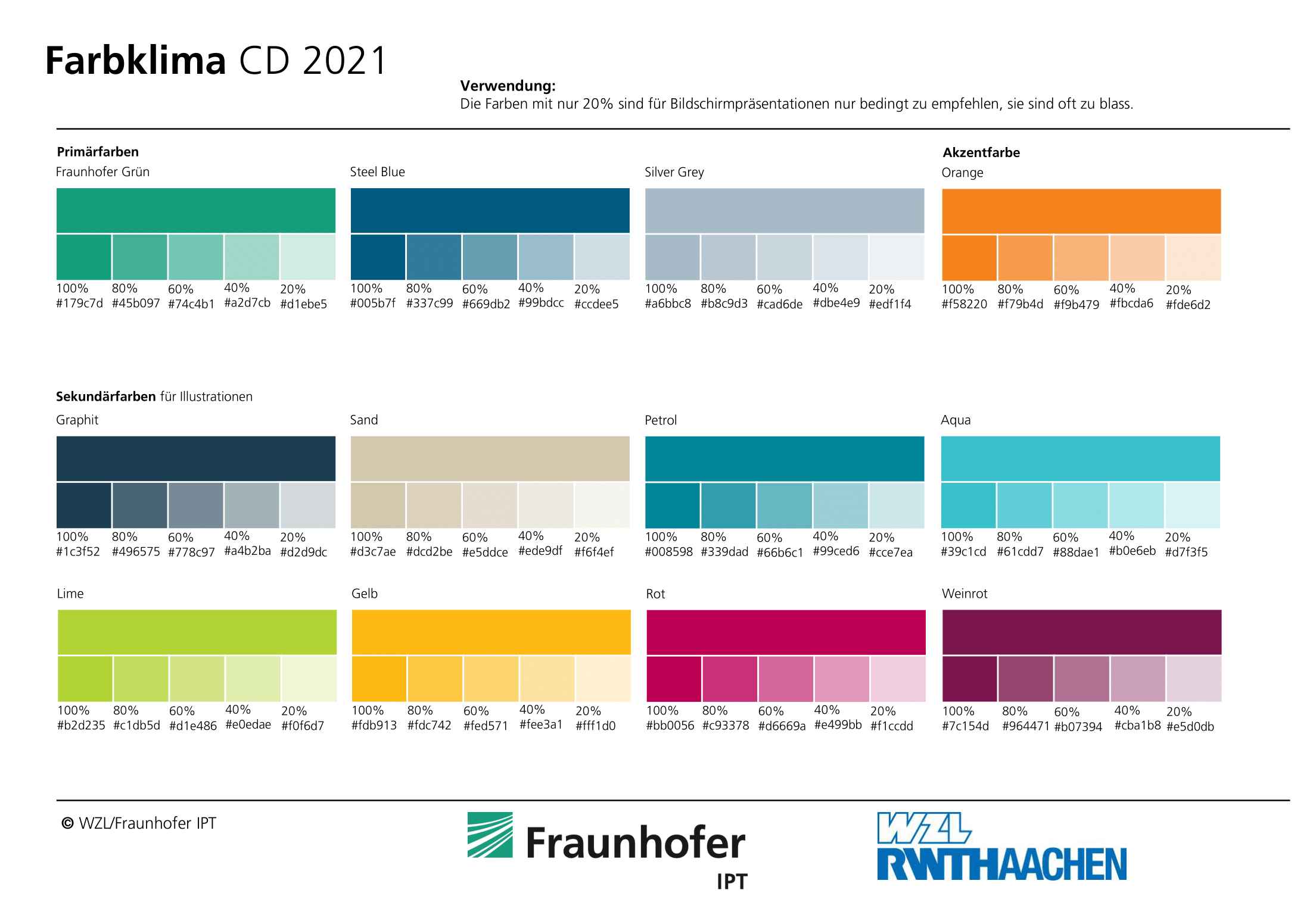
RWTH and Fraunhofer Guidelines
Based on the feedbacks and talks with the WZL and IPT PR departments, we collect additionals guidelines here. Keep them in the loop for your work in best case.
- Always use Roboto (Variante Bold 700) fonts for charts and text
- To not change the font size / color without explicit permission
- To not alter/change the Logos of RWTH/Fraunhofer without explicit permission
- Check your wording and nomenclature with your local department/PR
- Text block always have to be left-aligned (old dashboards sometimes had justify)
- All what you present via dashboards is by default world public. Please contact us if you want a WZL/IPT exclusiv dashboard
- Use the corporate design colours:
Fraunhofer
- Before communicating a dashboard to the public, get a feedback from your PR department
- This also holds for fairs and conferences
SimpleDashboard
There are different display configuration for the order of text boxes and images in the standard poster format.
Mobile display will be vertically arranged:
- Image 1
- Textbox 1
- Image 2
- Textbox 2
Full screen display order:
- Top-Left: Image 1
- Bottom-Left: Textbox 2
- Top-Right: Textbox 1
- Bottom-Right: Image 2
ContactCard
The contact card is a recurring element, such that all users know about where to get in touch for detailed information. Also you can include your team members or (short) description texts. The QR code is a vCard allowing the users to store information about the experts fast.
For Simpledashboards, set the contents of the contact card via the edit mode online, as the local json file for debugging gets overriden!
Dos and Don'ts
Do
- Be respectful with the time of the users
- Allow fast determination of key benefit
- Use images, animations and very brief text elements
- Allow interactions for users to "touch" your project directly
- In case of "live" data, prepare a replay for the time, the machine is offline or not doing interesting stuff
- Ideally: Tell a story with your dashboard
- Think about different screen sizes (smartphone, tablet, Desktop)
Don't
- Create Wall of Texts - most users will never read it
- Live-only view - If your machine stands still, your dashboard shows no value
- Information-bombardement - If you try to show all information at once, users have no chance to find their way into your topic
- Huge 3D models - If you use 3D models, try to reduce them with respect to the users devices having to receive and render it (also, extensive rendering drains battery fast)
- Browser-specific features - You do not know beside your own device(s), which setup users have. If you rely on specific features (e.g. only chrome) you loose users immediately
Helpful frontend libraries
- Material Design Lite: Standard library used for basic design elements. https://getmdl.io
- Chart.js: A library for (animated) graphs and charts https://www.chartjs.org/
- three.js: A library for displaying and rendering 2D/3D objects (e.g. STL-files from your products) https://threejs.org/
- D3.js: A library for Plots and Data Driven Documents https://d3js.org/